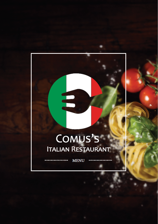
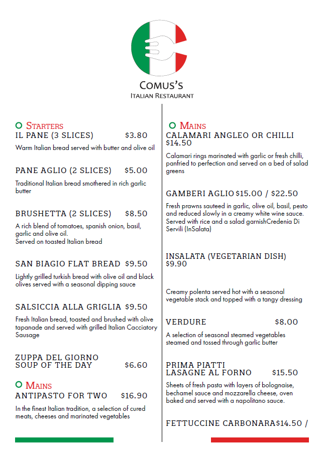
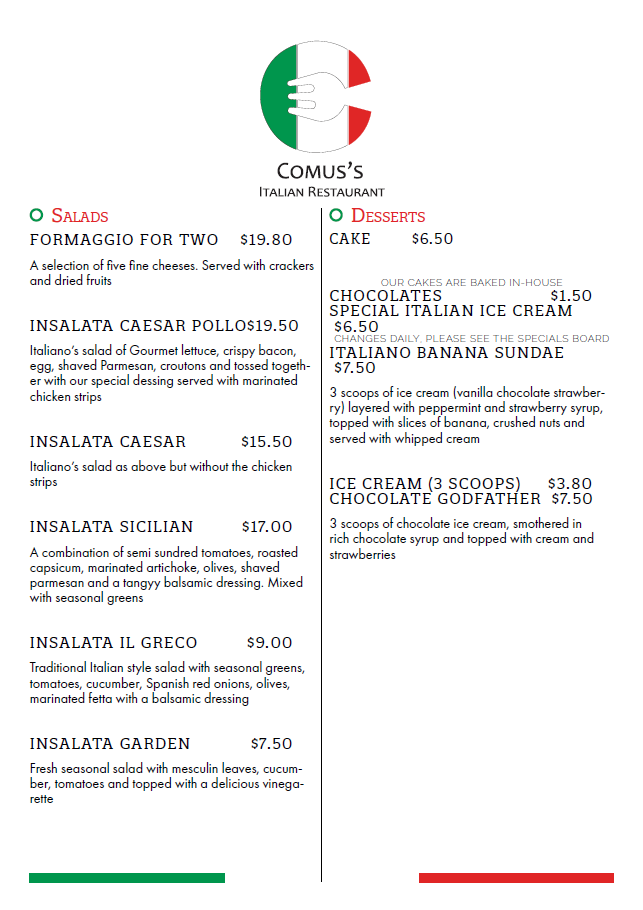
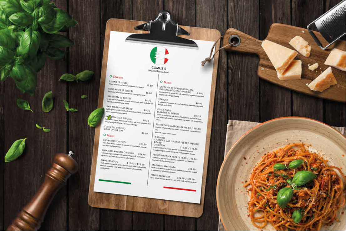
Comus Italian Restaurant
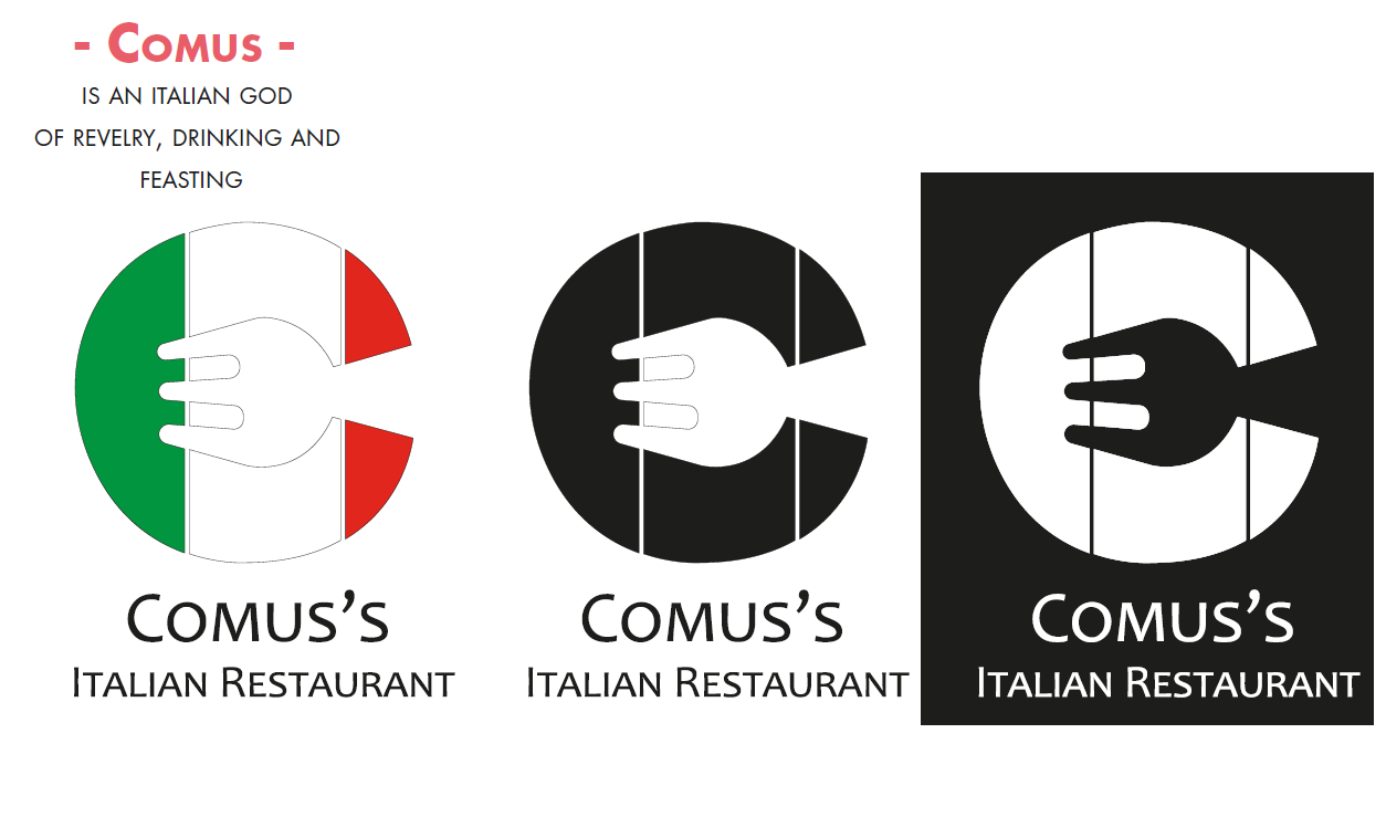
Comus Italian Restaurant was a restaurant that I created. Comus - is an Italian god of revelry, drink and feasting.
So I went with colour of Italy, and adding the fork was a great idea for a Italian restaurant.
So I went with colour of Italy, and adding the fork was a great idea for a Italian restaurant.
Smith's RecipeBook
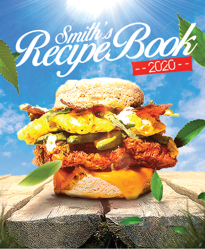
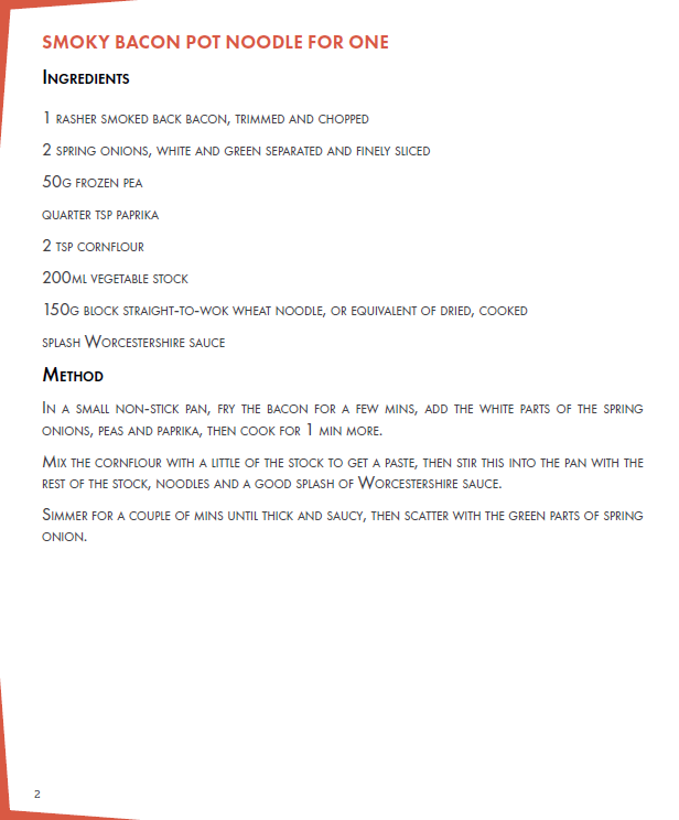
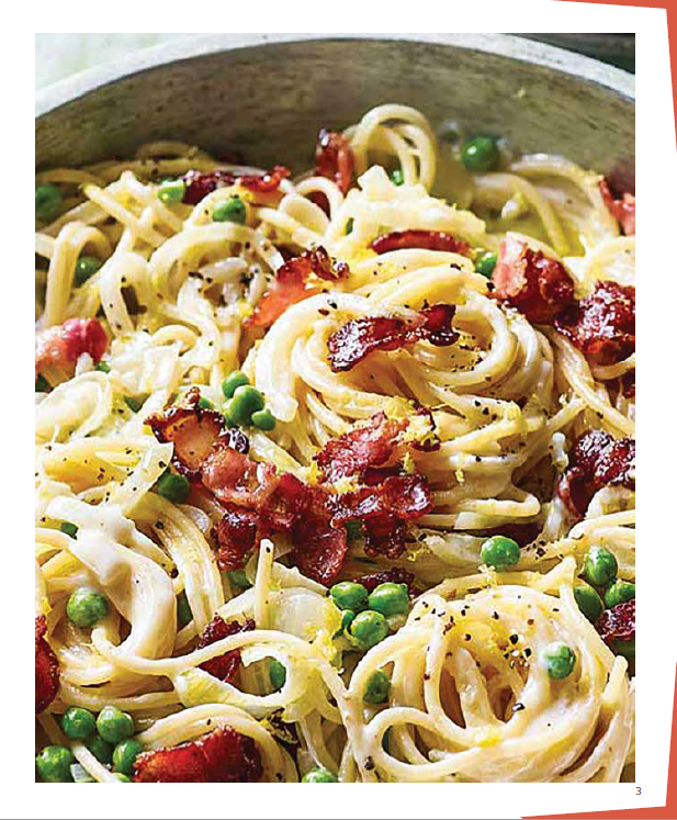
Smith's Recipe Book was menu I designed for myself for around the house.
As you can see, with the front cover, I went with a manipulation type menu. The front cover was designed all in Photoshop. And the menu was designed in in-design. The menu is 68 pages long with the same style applied on each page.
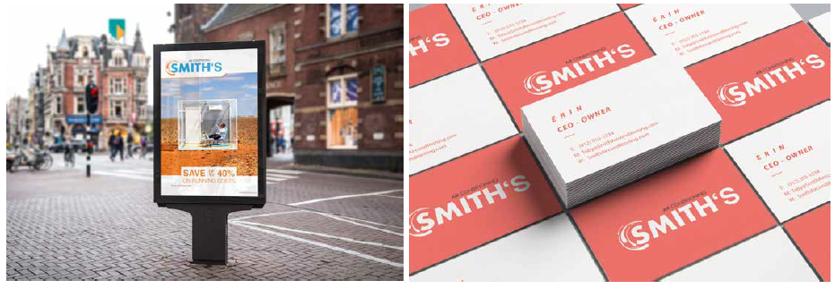
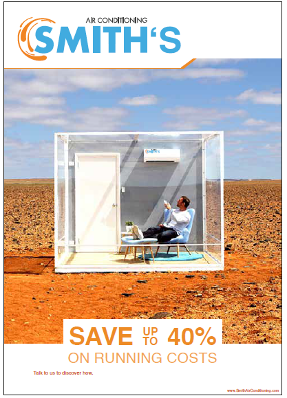
Smith's Air Conditioning
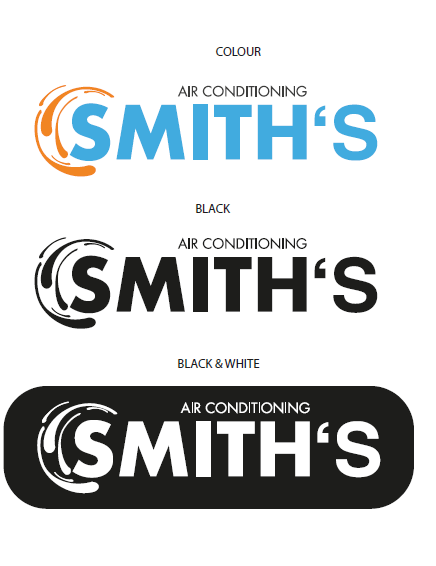
1. So the colour I went with is Cyan Blue, black and Orange. The reason why
I went with these colours is because the orange and blue gives a chill and
heat feeling, which is ideal for an air-con company I didn’t want to go with
red, since its to aggressive.
2. The size of image I used is 150ppi. The original image was 299ppi, but I
took it into photoshop and made the resolution of the image 150ppi, since it
doesn't need to be the highest resolution cause i only have one image and it
needs to be the best quality for a poster to be seen from far.
3. As you can see I went through alot of typefaces, but i chose to run with a
simple typeface. I went through so many decorative typefaces but wasn’t
happy with the look. So i went with Futura Bold