
Typography Posters
So for this project, I had to design two typography posters.
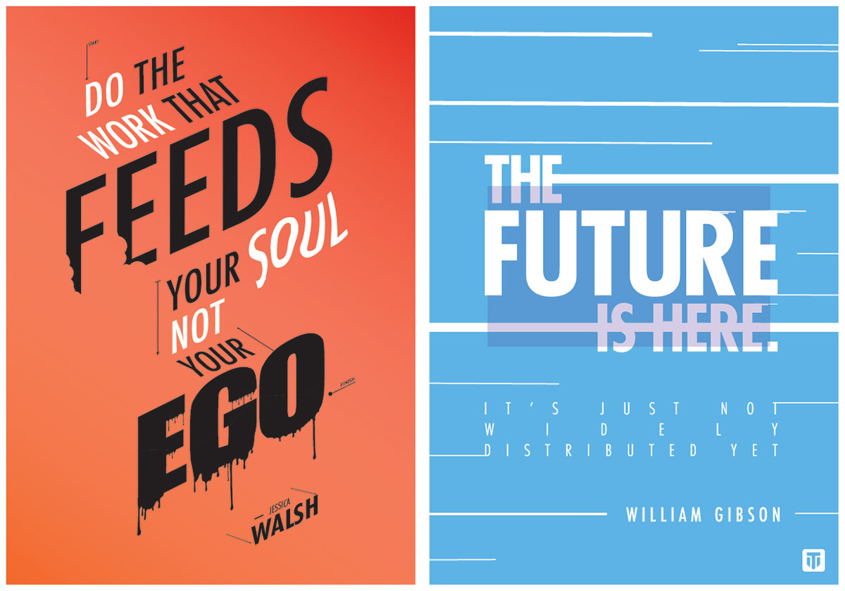
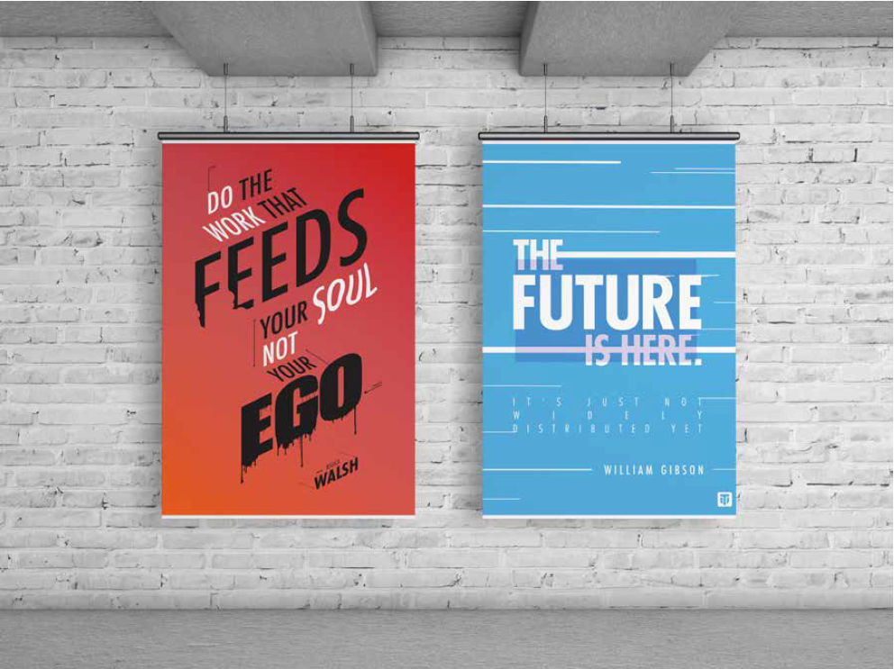
- For the first poster the quote comes from a designer Jessica Walsh. She is the founder and creative director of & Walsh (andwalsh.com). She lectures about design at creative conferences and universities internationally. She teaches design & typography at The School of Visual Arts in NYC. Her work has won numerous awards from most major design.
So the idea came through the way she rise up. So a staircase theme was added.
So the idea came through the way she rise up. So a staircase theme was added.
Now for the second design the quote comes from another professional designer called William Gibson. In the 1990s, Gibson composed the Bridge trilogy of novels, which explored the sociological developments of near-future urban environments, postindustrial society, and late capitalism.
So the idea made think of the old times and future, and combine the both
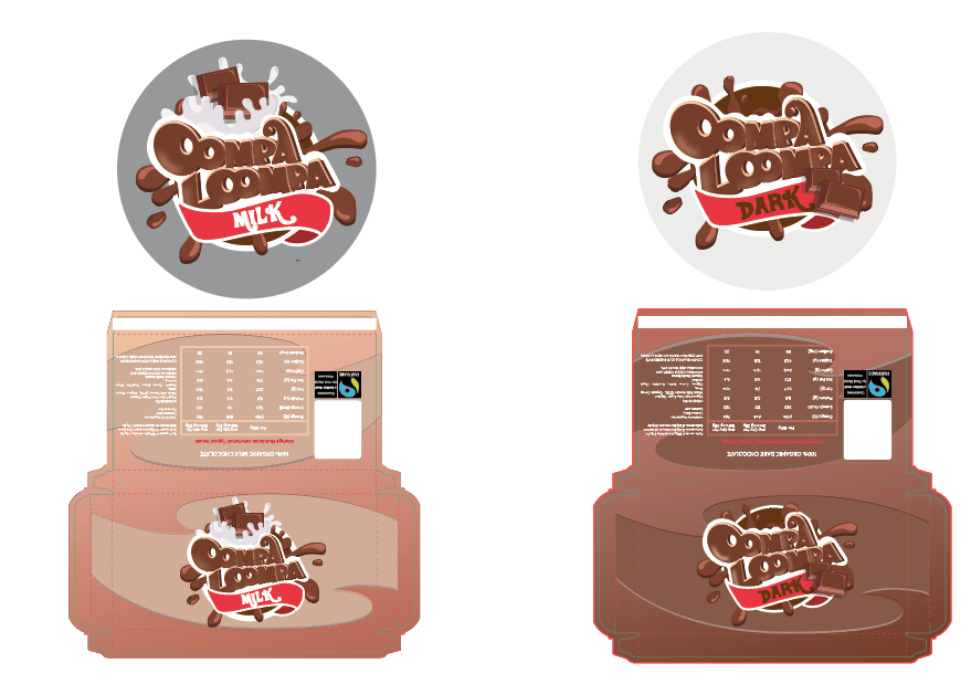
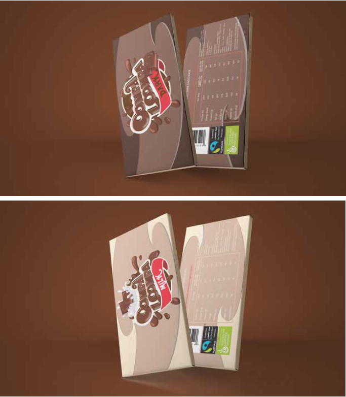
Oompa Loompa Chocolate Bar
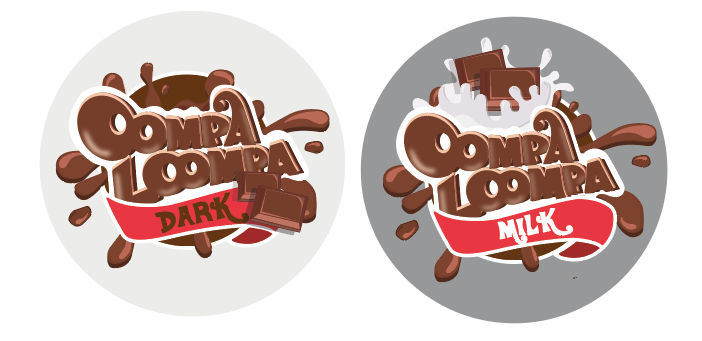
On this project I had to design a chocolate bar. I decided to run down the line of Wonka bars - which made me go with Oompa Loompa idea.
I designed a dark and milk chocolate for every suitable customer.
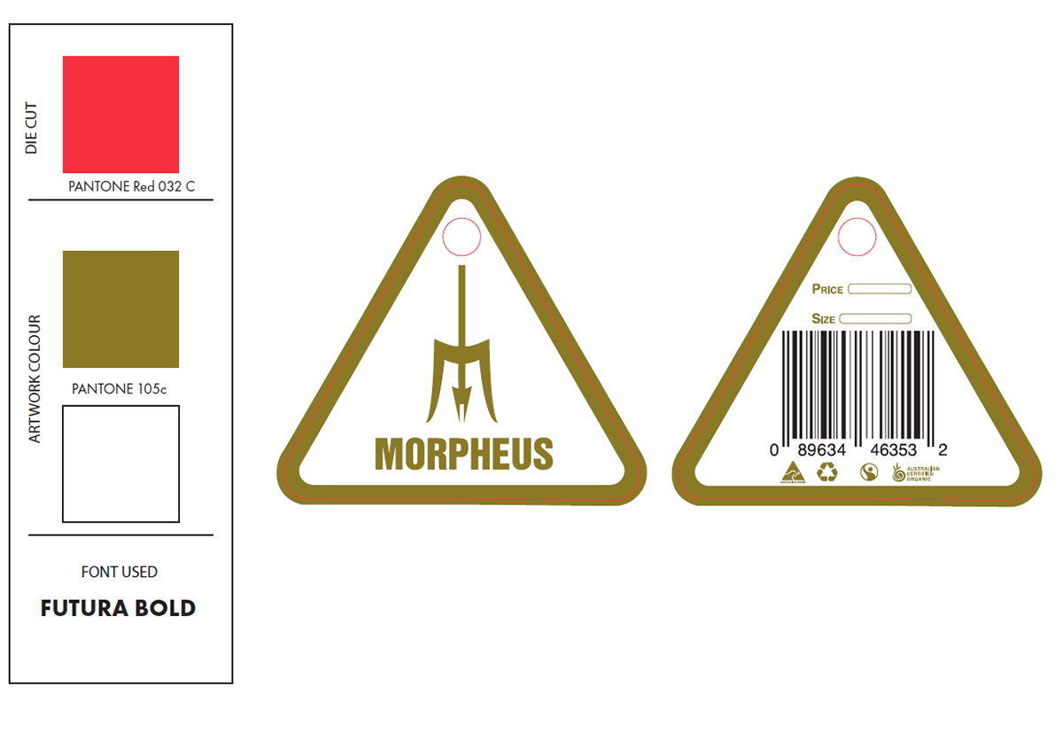
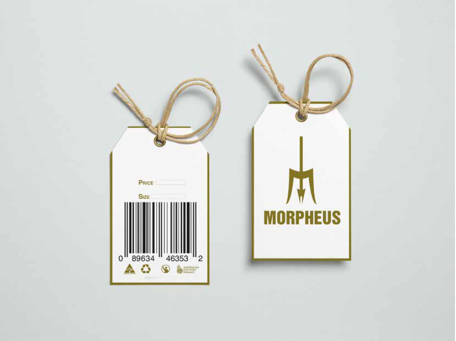
Morpheus SwingTag
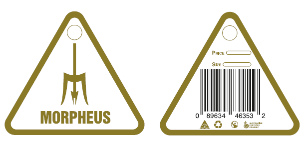
On this project I had to design a clothing brand to suit a swing tag. I decided to run with Morpheus.
The reason why I chose Morpheus as a clothing brand, because Morpheus means "god of dreams".
So I thought of Greek colours and style. The Staff in the middle of the logos symbols an "M" for a creative look.
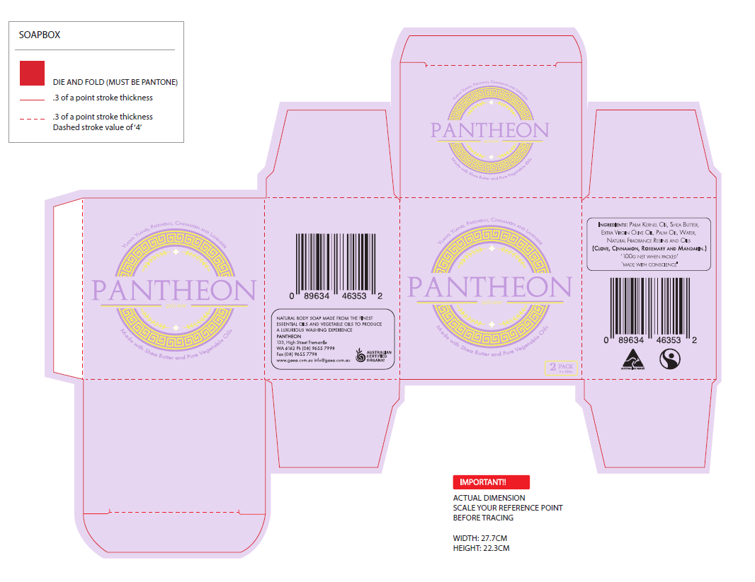
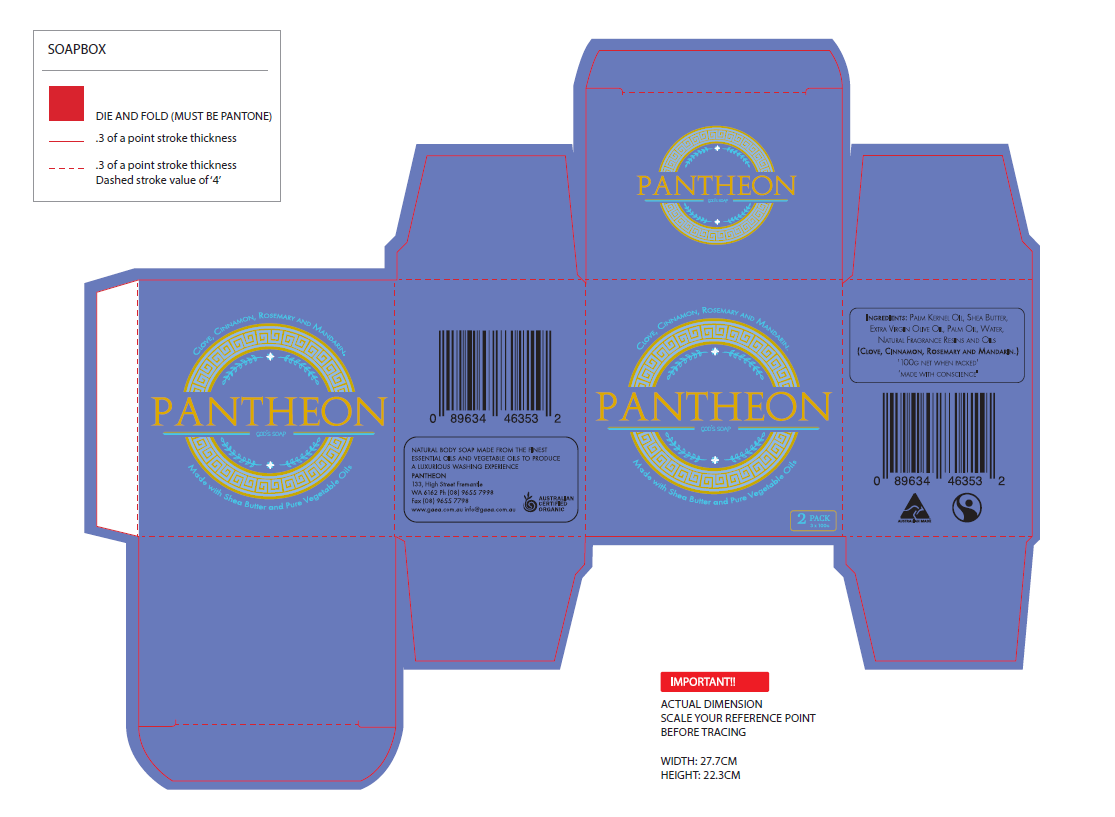
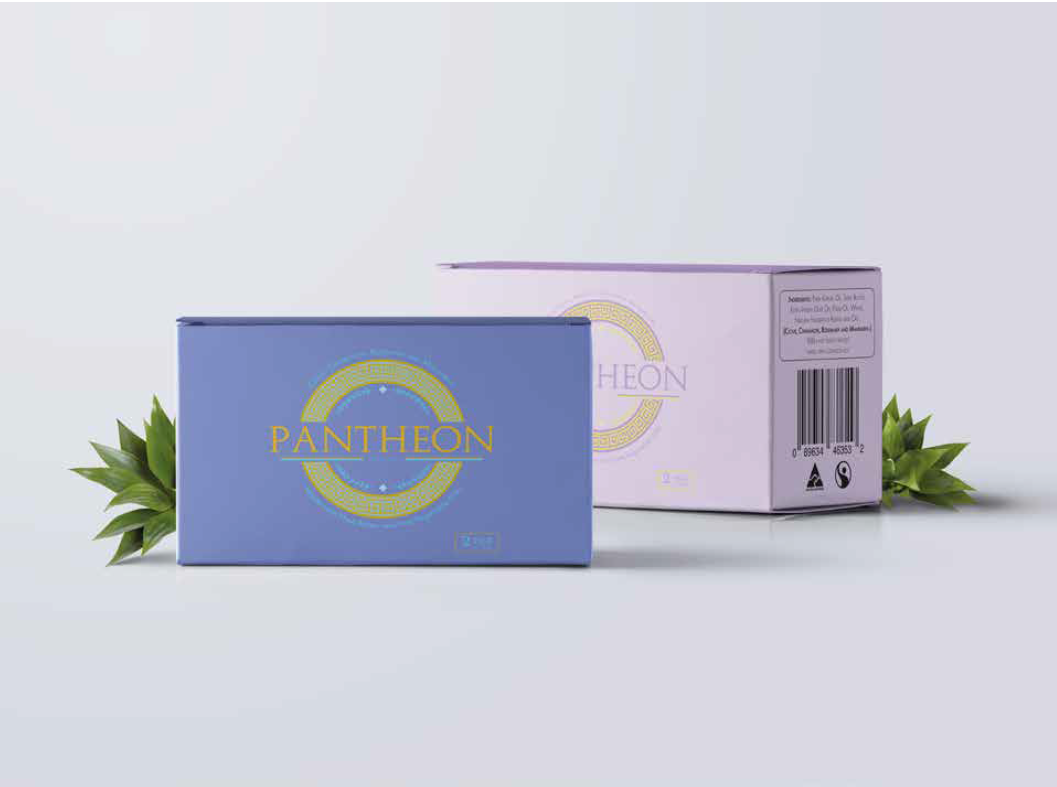
Pantheon Soap-Box
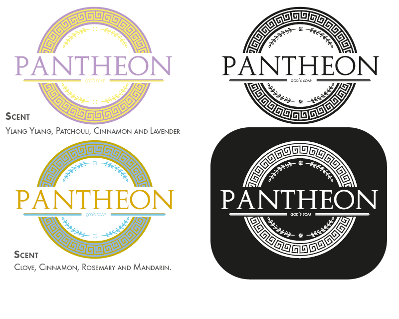
The idea I went with this was a god greek soap box.
PANTHEON CAN BE INTERPRETED AS A GROUP OF GODS.
So the soap is made for rich or fancy hotels. The main focus i went with was clean and elegant.
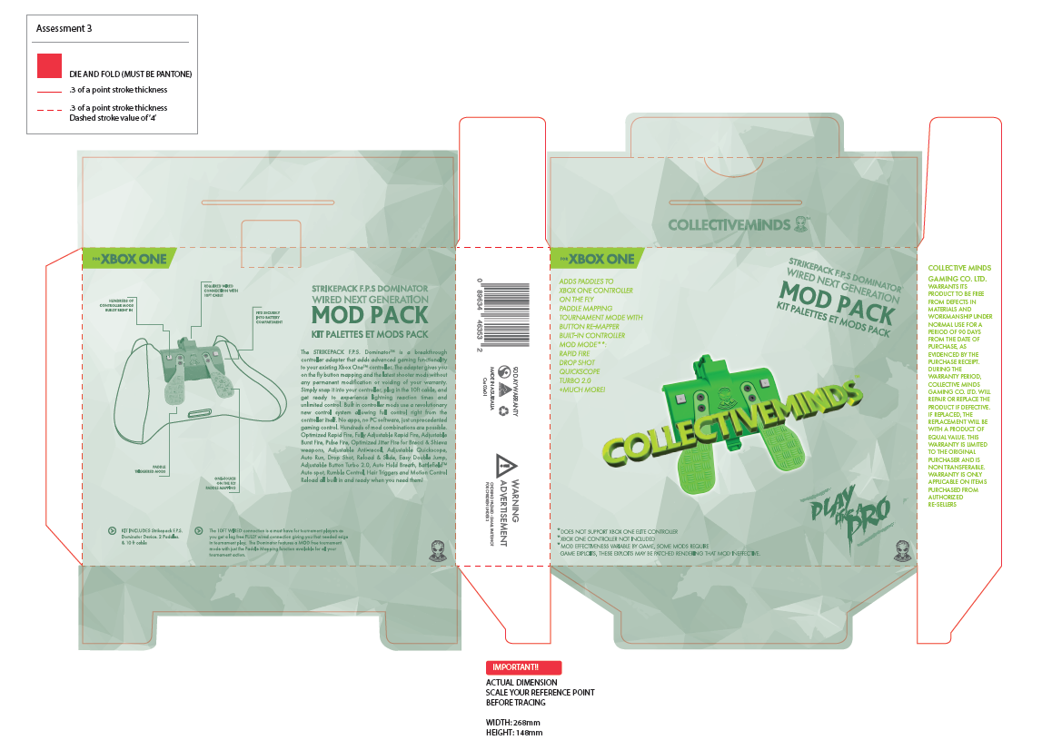
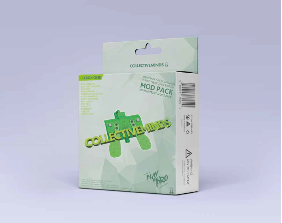
Re-Design CollectiveMinds
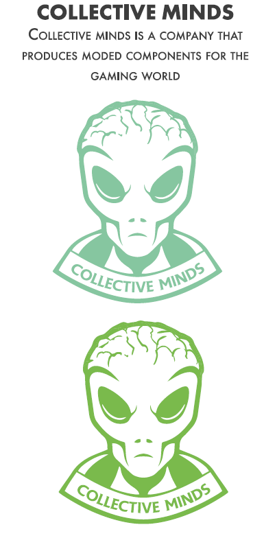
On this project I had to re-design collective minds strike pack package.
The reason why I chose to do this company, because I thought it would be the best to re-design since the
design on the box isn't that great and doesn't really pop. So i decided to re-design it and make it in my own style, I also
re-designed the logo.
The reason why i chose to do an alien is cause modifications cause symbols to out of this world phrase
Personal Ad Poster
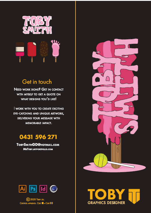
As you can see this is a project I did for myself.
This ad Poster was designed to promote myself.
The idea I decided to run with was kinda goofy. The reason i chose this is to catch the eye, and slowly draw them in.
The ice-cream style is a bright and clean style.
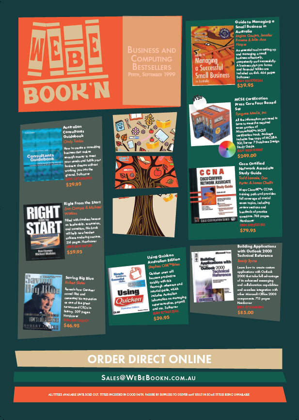
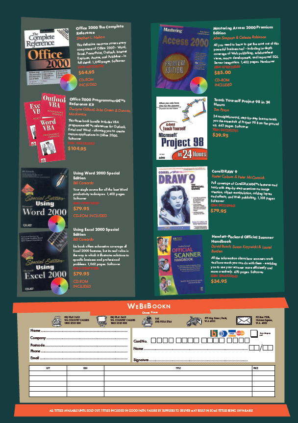
We Be Book'N
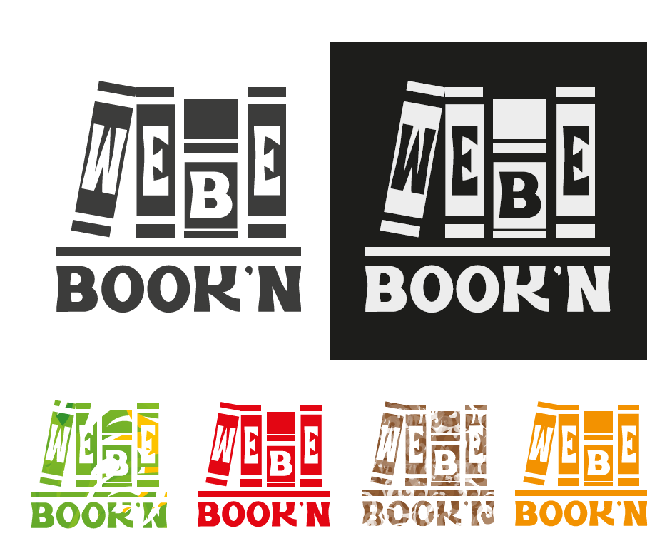
We Be Book'N was flyer I had to re-design. "We Be Book'N" is a book club.
So I decided to design a goofy style book club flyer, which also aligned with the colour on the logo.
I also had to design a .Gif for a banner for the flyers.

Billie Eilish Illustrator
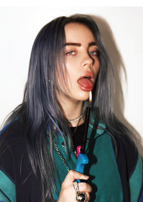
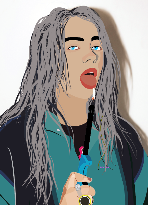
This was a design I did for fun, the process of this was quite creative.
This was made up over 300 layers.
The reason why I chose this image was because to see if could make and illustrator version of Billie